The 10 most common flat design mistakes – interior design principles
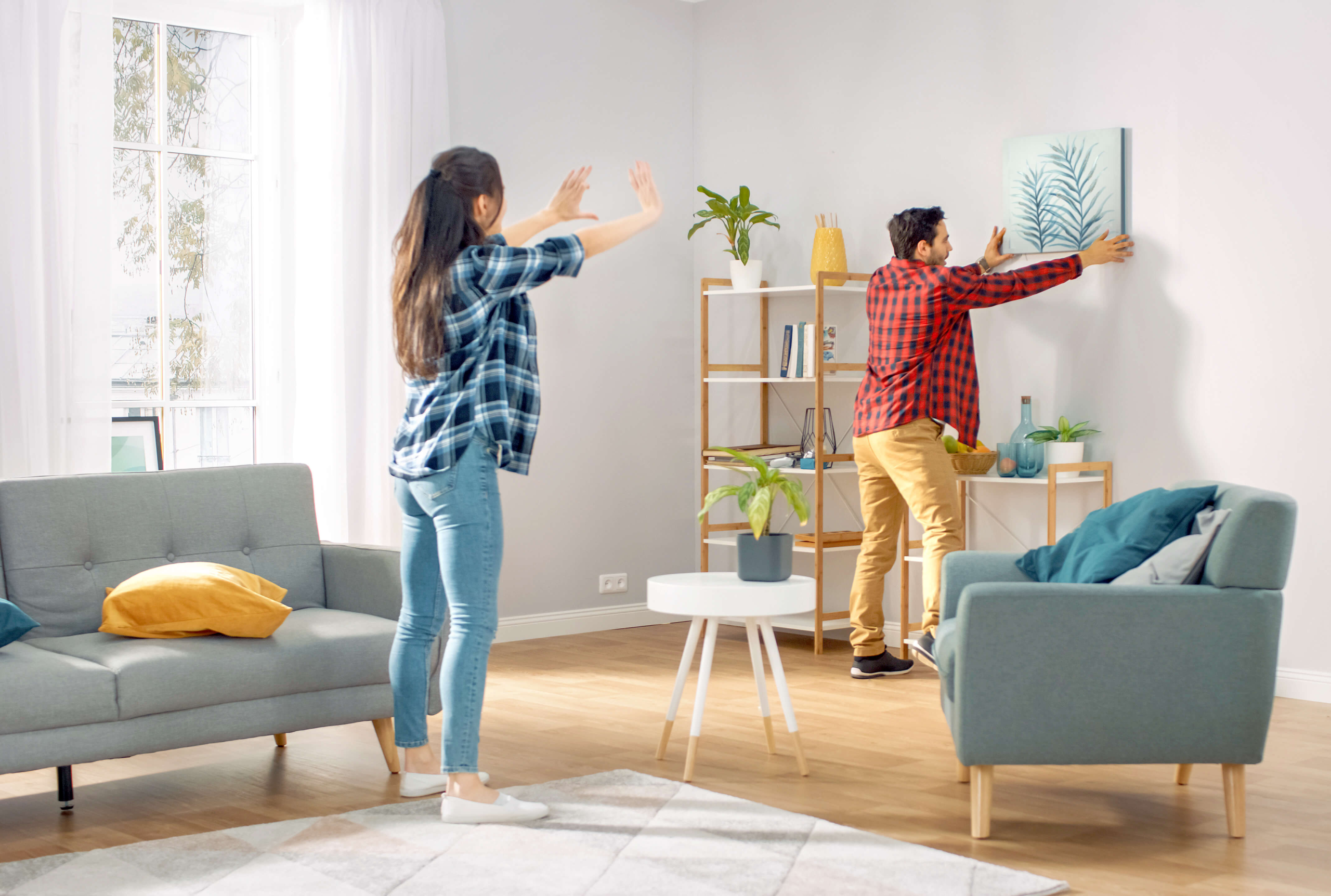
Anyone who has decorated an interior at least once knows that it is easy to make a mistake when creating an arrangement, which is only visible in the final effect when everything is ready. Therefore, it is worth thinking carefully about the whole stylization and learning the basics of interior design, in order to avoid disappointment. The principles of interior design are governed by their own laws. We will never be able to avoid mistakes, but we can help you minimise the risks and protect you from the most common interior design mistakes. Learn the basic rules of interior design and the 10 most common mistakes we tend to make.
1. Uncritical following of fashion
Willingness to follow fashion can be disastrous. This can be especially true for the colours that are in vogue every year. Some colours make us feel better, others worse, and they can be simply tiring. This also applies to design. When we blindly follow the fashion, we can create a rather standard styling, in which our individuality is lost. After all, not everyone has to like the same things. So follow the rule – be inspired, not copied. Trendy stylizations, which we like, e.g. in interior design magazines or on the Internet, should be modified and adjusted to our own needs and preferences. We must also remember that trends are constantly changing and even the most fashionable style or colour will soon be out of fashion. A reliable way to cope with the ever-changing fashion is to create a universal arrangement base, which from time to time can be adjusted to the current trends by means of fashionable accessories.
2. Excess accessories and trinkets
An excess of accessories and decorative trinkets creates unpleasant chaos. Not only will our arrangement lack cohesion, but it will also be difficult to calm down and relax in such an interior. Souvenirs from our travels or items accidentally bought on sale should be removed or moved to a place where they will not compete for our attention every day. Minimalism does not have to mean boredom. Less is more – this wisdom should accompany us in interior design. Our flat is not a museum. There is no need to collect exhibits from which we do not always have time to wipe the dust.
3. Furniture against the wall
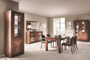
Placing furniture against a wall is an old-fashioned way of arranging interiors, which unfortunately survived until today. Furniture placed this way optically reduces the size of an interior and creates unused space. This is considered a mistake, especially in the case of large interiors. Putting a sofa in the middle of the living room and placing a designer desk behind it will be an unusual solution, and will also allow separating two zones: for rest and for work. Of course, you can’t always completely dispense with putting furniture against the walls. The key to creating an interior, which will not give the impression of being cluttered, is to choose low furniture. We should also consider whether we really need to have all the furniture from the series offered by the manufacturer. First of all, let us resign from arranging a wardrobe, a segment and a display cabinet in a row. Merely separating these pieces will have a positive influence on the interior arrangement.


4. Too little light
When at the stage of designing a new interior the appropriate number of light sources is not anticipated, a big problem arises. Light is one of the most important aspects of a well-arranged interior. Such rooms as the kitchen, the bathroom and the workplace deserve special attention in this respect. These are the areas where we usually spend most of our time and where we carry out activities that require precision and therefore appropriate lighting. The most common mistake is to focus mainly on the appearance of the lamp and not on its light output. Yes, lamps in an interior are like jewellery – they have to match the style. But we cannot forget that first of all they should give the appropriate amount of light. We feel more comfortable in interiors with the right number of light sources and their intensity.
5. Unbalanced colours and patterns on the walls
It’s a well-known fact that we relax best in interiors with muted colours and unobtrusive designs. As walls are the largest surface to decorate in our homes, we must be sensitive not to overdo it. It would be a mistake to cover all the walls of a room with fashionable patterned wallpaper or to paint them in your favourite intense colour. When choosing colours, it is worth following one of the principles – 60:30:10. According to it: 60% is the basic colour, which is to tone down the interior, and 30% is the complementary colour. 10% is left for introducing a contrasting colour, not on walls, but in accessories, which can be easily replaced when we get bored.


6. Putting design before ergonomics and functionality
Practice shows that we make most design mistakes in the kitchen. Decorating this room requires thinking about many aspects so that we can use it comfortably every day. A common mistake is improper placement of appliances, e.g. placing the sink and the hob too close to each other. We want to have a fashionable island in a small kitchen and all the necessary household appliances, and then it turns out that we cannot fully open the dishwasher because it is in the way ….. island. Not everything that is beautiful and designer is practical in our homes. Nevertheless, we often give in to fashion, not caring whether it will be functional or whether we will find space for it.
7. Skipping proper window styling
Short curtains in a spacious living room, fancy pinned up curtains in a modern interior, fitting day/night blinds regardless of the style, too much creasing of patterned curtains blocking a beautiful view outside the window – these are the most common mistakes I encounter. Well-chosen window decoration is like an extra piece of furniture. So let’s match it to the arrangement, to the size of the space and to our needs. In modern, loft or Scandinavian style simple, long curtains will be perfect. You can then resign from traditional curtains in favour of wooden or aluminium blinds. In minimalist interiors, you may resign from fabrics in the window, in favour of decorations placed on the windowsill. The style of the interior should determine the choice of window decorations.
8. Lack of consistency
Decorating each room in a different style is not a good idea. And don’t use the argument that you couldn’t decide on a particular style, so you used several. The atmosphere of a living space should aim to create harmony, order and peace so that we can calm down and relax when we return home. Let’s opt for muted, bright colours, which will serve as a base for the whole flat. The purpose of individual rooms will make them different from each other, not only in terms of furnishings, but also the style of accessories.
9. Hanging the TV too high
This is a common mistake that is repeated in our interiors. It proves that we do not think about comfortable watching TV, but focus on making the TV look good on the wall. Meanwhile, the rule is simple – the TV should be placed at the eye level of a person sitting down. It does not necessarily have to be hanging, especially when we have not foreseen hanging cables that can no longer be neatly concealed. In such situations, it is better to use designer stands, which manufacturers currently include TV sets. We can, and even should hang the TV in the bedroom higher than in the living room. Watching TV in a lying position requires a different TV position.
10. Forgetting about your needs
This happens when we want, for example, to copy the interior design from an interior magazine, where all the elements are beautifully matched. We want to decorate in the same way to impress family and friends. But it often turns out, for example, that curtains that fall heavily to the floor may look beautiful, romantic and palatial, but they collect dust and make a great bed for our cat. With two small children, designer velour quilted chairs no longer look like they did at first. They bring us more work and discourage us from using them, while they were supposed to be maintenance-free. We also forget about our own needs when, having no vision of our own, we rely on the knowledge and ideas of those closest to us, who do not take into account our preferences, treating our interiors as an opportunity to prove their talent. Remember that beautiful interiors are, above all, those in which we ourselves simply feel good.

